I’m an Interior Designer, and These Are the Design Rules I Would Never Break
- May 6
- 3 min read
There’s something rather magical about a beautifully designed space—it feels effortless, considered, and entirely you. But behind that ease is often a quiet structure of principles that guide every decision.
Over the years, I’ve found that while trends come and go, certain design rules remain steadfast. They’re the small, often overlooked details that make the difference between a room that simply looks nice and one that feels truly refined.
If you’re looking to elevate your home with intention, these are a few design rules I personally never break.

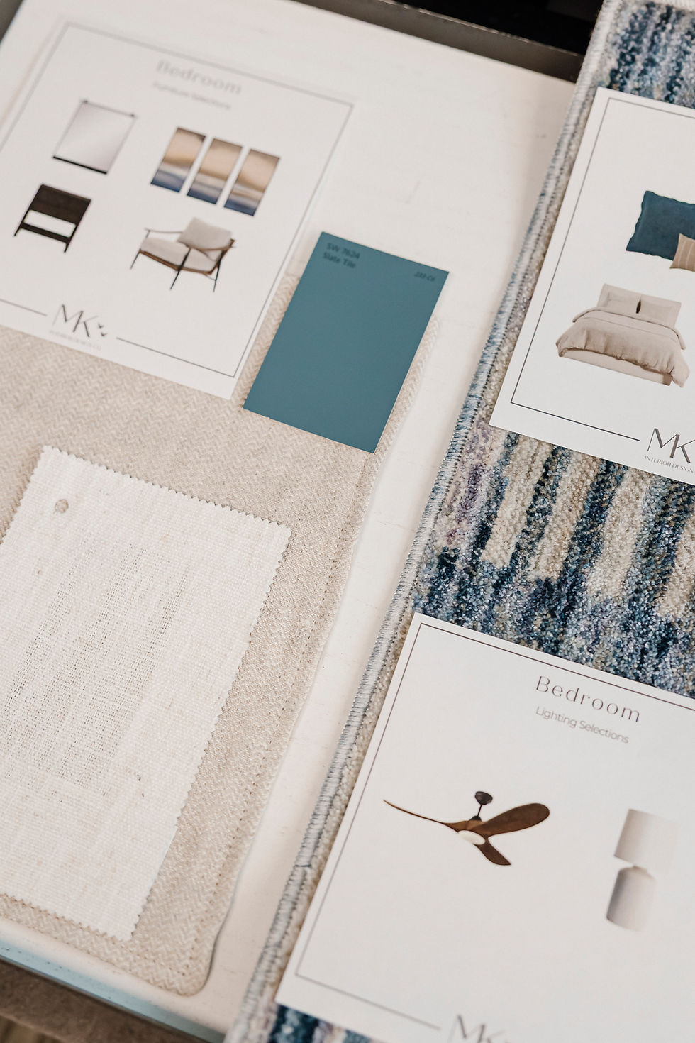
1. Avoid Matching Furniture Sets
It might feel like the safest option, but perfectly matching bedroom sets can fall rather flat. A bed, dresser, and bedside tables that are all identical can make a space feel more like a showroom than a home.
Instead, opt for pieces that complement rather than copy one another. Mixing materials, finishes, or silhouettes introduces depth and personality—resulting in a space that feels layered and thoughtfully curated.

2. Always Consider Eye-Level Placement in the Bathroom
Lighting and mirrors in a bathroom should sit comfortably at eye level. As a general rule, wall sconces should be installed around 60–65 inches from the floor.
The same principle applies to mirrors. When these elements are properly aligned, the entire space feels more balanced and functional—without you quite knowing why.

3. Don’t Be Afraid to Mix Wood Tones
One of the quickest ways to make a space feel flat is by using the same wood tone throughout. Contrast is your friend.
Combining lighter and darker woods adds richness and visual interest, helping each piece stand out while still working harmoniously within the room.
4. Play with Scale in Patterns
When incorporating prints—whether in upholstery, cushions, or soft furnishings—it’s essential to vary the scale.
Pairing a large, statement pattern with a smaller, more subtle print creates a sense of rhythm and balance. Too much of the same scale can feel overwhelming or, conversely, underwhelming.

5. Get Kitchen Lighting Proportions Just Right
Lighting above a kitchen island isn’t just practical—it’s a focal point.
Pendant lights should typically hang 33–36 inches above the island surface, with approximately 30 inches between each fixture. These proportions ensure the lighting feels intentional, evenly spaced, and visually pleasing.

6. Hang Curtains Higher and Wider Than You Think
If there’s one trick that instantly elevates a room, it’s this.
Mount your curtain rod about 12 inches above the window frame—or roughly two-thirds of the way between the window and the ceiling. Extend the rod 6–12 inches beyond the window on either side, and ensure your curtains just graze the floor.
This simple adjustment draws the eye upward and outward, making the entire space feel larger and more elegant.

7. Follow the 60-Inch Rule for Artwork
Artwork should be hung so that its centre sits approximately 60 inches from the floor—this aligns with average eye level.
It’s a small detail, but getting it right creates a sense of harmony throughout the room. When art is hung too high or too low, it can subtly throw off the entire space.
Design Rule Final Thoughts
Good design isn’t about rigid rules—it’s about understanding the principles that allow a space to feel both beautiful and functional. Once you have those foundations in place, there’s plenty of room to play, experiment, and make it your own.
Think of these rules not as limitations, but as quiet guidelines that help everything fall into place just as it should.


Comments